Benedetta Tagliabue, Miralles Tagliabue
ArchIdea 61 Interview
September 2020
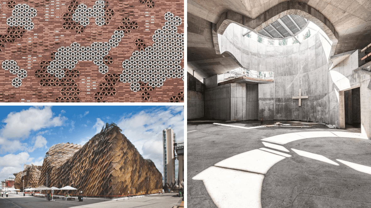
The copious details – playful, colourful, joyful and often so abundant that even the term detail itself becomes blurred – are what characterizes the architecture of EMBT. The focus on detail seems to be a statement, given that elaborate and meticulous detailing is today anything but a matter of course. Does Benedetta Tagliabue, who founded Miralles Tagliabue EMBT twenty years ago with her now deceased husband Enric Miralles, consider her approach to detail essential to her architecture?
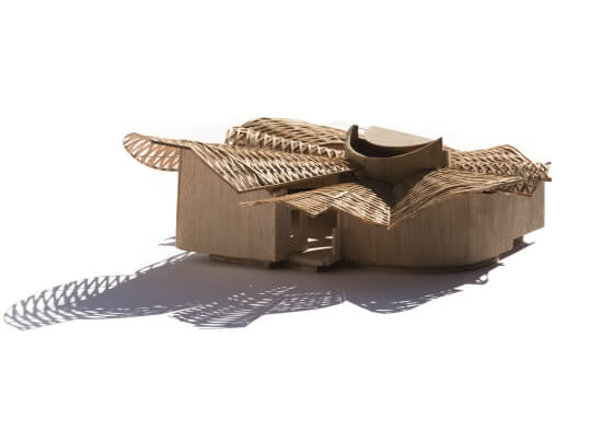
"Yes," she confirmed in her studio in Barcelona, "attention to detail, to how you are going to build, frequently determines the whole design. When we had to design the Spanish pavilion for the World Expo 2010 in Shanghai, for example, it was a detail that came first into our minds. We decided the building should be made of wickerwork. It was experimental and we didn’t know how to build with wicker, so we had to invent a way to fabricate wicker panels. It took us a long time to find how to work with the material, which has to be done by hand, and how to transfer the wicker technique to a larger scale. Then we had to work out how to hang the panels and connect them to the overall geometry of the pavilion. The wicker panels ultimately formed the basis of our design."
What prompted you to choose an almost archaic material like wicker?
"A World Expo is very much about being experimental, about proposing new techniques and inventions. The theme of the Expo in Shanghai was the rapid urbanization of China, with the consequent striving for better cities and better lives. The Chinese tend to think of building cities full of shiny skyscrapers, but to me a better city would be one that doesn’t entail an abrupt fracture with the countryside. On the contrary, I prefer a city that connects with its rural surroundings. I thought of wicker as a direct way of making this connection. Wicker is an ancient material, and it always needs hands to weave it. The language of creating things by hand is a universal human language. It is fantastic to see that the art of making useful articles with wicker is more or less the same all over the world. When we started work in China, we were worried whether we would be able to understand one other. We were afraid that different ideas and preferences would be a stumbling block. But making wicker, working with the hands, turned out to be common ground."
There is so much wicker in the pavilion that you can hardly describe it as a detail, can you?
"You can, but it's a detail that has come to determine everything. The same happened with our design for an exhibition in Il Vittoriano in Rome, a huge, pompous building that was built around the end of the 19th century to celebrate the unification of Italy. The purpose of the exhibition was to explain Italy to the Italians. We started with a basic question: how do we want to build it? We had limited time, so wood was an appropriate material. This led to the idea of a scaffolding, of something not yet finished. We used steel as well as wood, so the impression of being under construction came together with durability. That could be interpreted as a metaphor: Italy is not yet 'finished', like any other country. But I must say I don’t like the feeling of things being finished in general. I prefer the idea that everything is a process, that everything is developing. Of course, this is even more true for something temporary like an exhibition."
"It's a bit like the romanticism of the 17th century, when the vogue for ruins began. A ruin connects us with the past and at the same time holds out the possibility of regrowing, of being in the middle of a process and becoming a building."
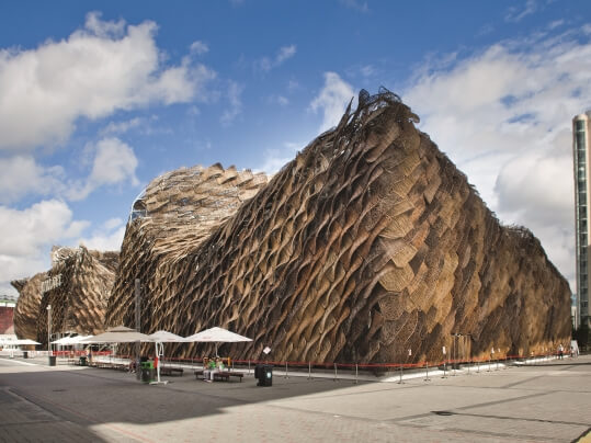
Spanish Pavilion Shanghai 2010
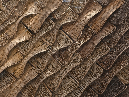
Spanish Pavilion Shanghai 2010
Details are often changed by a building contractor during the building process. It's all too easy. How do you keep control over the details?
"If you suspect that the contractors won't ask you about details during construction, you should design as many details as possible beforehand. Of course, you cannot design everything in advance and many decisions have to be made on site. There is no guarantee that the contractors won't come up with a plastic piece instead of a ceramic one. I see it as a learning process. If they use plastic instead of ceramic, you can ask yourself whether you should work with printed plastic next time, but in a different, honest way. To us, it is always interesting to learn how others work. Sometimes we accept it and sometimes we don’t."
Details can be subservient to the whole, or they can tell a contrasting story, possibly even contradicting the overall architectural concept. In which way do you deal with details?
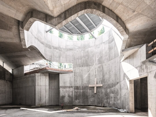
"First of all we try to design a building that relates in an honest way to the material that is used to build it. For a church in the city of Ferrara, we wanted to build a wooden roof. Wood is sustainable because you can replant trees while using it. But a wooden roof turned out to be too expensive, so the client decided to have a concrete structure and they asked us to cover it with wood. We didn’t want that because concrete can itself be beautiful, so we used wood for insulation but at the same time we kept the concrete visible. This is what we call honesty: we want to expose the reality of things. There is even an elegance to it. After all, you don't make your face disappear when putting on make-up, because you intend to help it, not to hide it."
In the way you use details, you seem to bring together opposing qualities like open and closed, weight and weightlessness, functional and non-functional. Can you explain why you create this dialogue?
"I suppose I have an interest in opposites, although I never thought about it. In general I think you cannot base architecture on just one idea. You always have many ideas at the same time, you develop them and as a result many different details are required. But it can also happen in small, simple interventions. For instance, Enric made an opening between this conference room and the office space where the architects work. And then he put a table in front of it, so there is a passage but you are not able to get through it. We have a lot of this kind of ambivalence in our work. We don’t like being too obvious."
Can you be more specific about the ideas that are behind the ambivalence and complexity in your work?
"Integration of the building in the landscape, in the city, is always very important to me. I don’t like a building that is just an architectural object without any relation to its environment. Architecture always affects the surrounding landscape, so you should consider it as a part of it. This is equally true for building in a city. A city is so rich, it is a landscape, a kind of nature too. The relationship between a building and a city is very complex. There are many layers, many possibilities of understanding it: architecturally, historically, culturally etc. I love this kind of complexity and I aim to respond to it in my architecture."
At the same time architecture is about reduction, about choosing what you use and what you don’t, about what you include and what you exclude. Do you have strategies to deal with this kind of complexity?
"That usually depends on the time available. A specific time span is always needed to finish designing or to arrive at a certain solution. It helps a lot to have an agreed time limit for completing the project. On the other hand, having an open-ended completion time gives us a chance to decide for ourselves when a project has reached maturity. That is why we like projects with a long time span, which often happens especially in Spain. The Kálida Centre project started about twelve years ago and it has only just been completed. The design developed over time, although in the end crucial decisions had to be made very quickly."
You normally start the design process by making collages. Are they a good way to insert the desired complexity in your designs?
"I started making collages a few years ago. Before then we started with sketches. Enric, especially, had a fantastic drawing hand, and many of our projects were based on his sketches. But I slowly moved away from this, and I no longer like the idea of making a sketch and then saying 'this is the project design'. I like to have more input to make the project come out clearly. It is also difficult to do something unexpected when your architecture is based on sketches. Your hand usually draws in your accustomed way, in the same way as handwriting. Collage makes it possible to be more open-minded and experimental, and it also helps you to work on it collectively. The design process has been one of continuous evolution. I didn't suddenly decide to change our approach to designing and radically throw away our old methods. It's like ascending a staircase, you use the support of one step to reach the next one and so on."
It seems like the collages contribute to a fragmented architecture, one with a lot of colours and ornamentation. Can you explain why this is attractive to you?
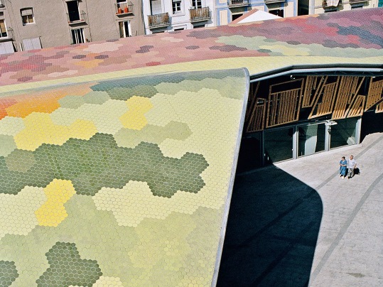
"For sure, it is something we enjoy doing. But it is above all about connecting the building with its context, about connecting the outside with the inside. For example we decided on the colours of the Santa Catarina Market at the end of the process. Our initial concerns were with the relationship with the city, with the wooden roof that would protrude to create a sheltered plaza, and the conservation of the historical part. But then we realised that the roof itself was important, because we wanted the public to understand what was happening inside. So we designed a roof with tiles in colours that referred to the fruit, vegetables and meat sold inside. It was a scary choice to make, because at that time not many architects made much use of colours, maybe nobody in Spain. I was afraid that we might be going too far, but fortunately many people assured me that they loved the building."
Your architectural approach seems to result in a dreamlike quality. All those fragments and references somehow make it easier to understand it intuitively rather than rationally.
"I like that interpretation of our work. I guess it has also to do with our system of making decisions. We sit together and say we like this, we don’t like that, let’s proceed in this way or the other. We think of all kinds of alternatives and many people are involved in trying things out. You could say that we dream together, so in the end intuition plays a decisive role."
Do you intend your buildings to help people escape from everyday circumstances by creating a distinct atmosphere?
"I try to do that most of the time. In the case of the Kálida Centre it was the essence of the design. I can't forget the terrible moment when Enric was discovered to be mortally ill. I thought my heart would break, and it seemed impossible to bear. Then all of a sudden, out of nothing, I found the strength to carry on. What I intended with the Kálida Centre was to create an 'in between' space where people with serious illnesses like terminal cancer can stay with their loved ones for a while. It's an opportunity to experience a different atmosphere from the hospital surroundings. That is what I intended with the Kálida Centre. Even if you are ill and you know it may end badly, you can have moments when you feel better and enjoy the company of others. We always care about the atmosphere of our buildings, about creating an environment that meets all the needs of the user."
.jpg)
Want to read more interviews like this? ArchIdea is our bi-annual magazine that features well known and upcoming architects from all over the world alongside some of the latest projects in which our floor covering has been installed.
To start receiving your FREE copy, sign up here