Pantone Colour of the Year 2024
December 2023
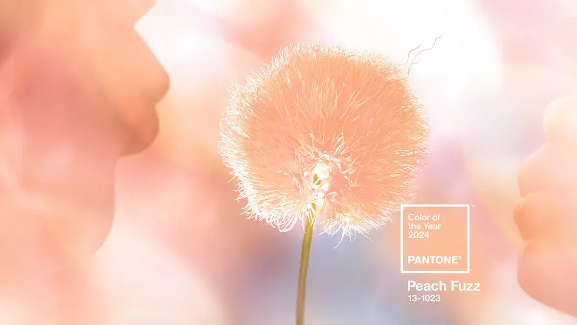
Pantone, the world's leading colour authority, has announced its 2024 Colour of the Year: Peach Fuzz 13-1023. The colour was chosen to express a yearning for community and cosiness during uncertain times.
Peach Fuzz is a compassionate and nurturing soft peach shade whose heartfelt kindness and all-embracing spirit enriches mind, body, and soul. The warm and subtle shade was chosen for its ability to "bring beauty to the digital world." According to Pantone, the shade is a light, fruity tone that conjures peace and serenity. The colour is described as "softly nestled between pink and orange".
.webp)
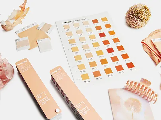
Pantone chooses its annual colour based on extensive cultural research. Marking the 25th anniversary of the Colour of the Year initiative, the gentle Peach Fuzz was based on a culmination of research conducted throughout 2023. As well as all areas of design, the institute monitored the entertainment industry and films currently in production, as well as travelling art collections, emerging artists, and the fashion world.
Peach Fuzz is a natural progression from last year's vibrant reddish-pink shade, Viva Magenta 18-1750, which was described as "brave and fearless".
"At a time of turmoil in many aspects of our lives, the Pantone Colour of the Year 2024 expresses our need for nurturing, empathy, and compassion, as well as our imaginings and desire for a more peaceful future," said Laurie Pressman, the institute's vice president.
“During a moment in time when a focus on our collective physical and mental wellbeing is paramount, Peach Fuzz encapsulates a need for a strong sense of community. It is a colour whose nurturing and cosy sensibility brings people together and elicits a feeling of tactility."
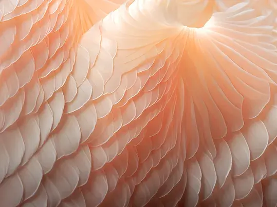
"In seeking a hue that echoes our innate yearning for closeness and connection, we chose a colour radiant with warmth and modern elegance. A shade that resonates with compassion, offers a tactile embrace, and effortlessly bridges the youthful with the timeless."
Leatrice Eiseman
Executive Director Pantone Color Institute™
%20copy.webp)
“We love how Pantone's new colour of the year connects with our own trend and colour research,” Dorothé Kessels, Director of Global Design at Forbo Flooring, explains. “In our latest in-house trend report, ''A World of Fluidity', we recognise that in these challenging times, there is a strong desire to reflect, connect, and care for ourselves and each other.”
“Soft colours, organic shapes, and tactile materials help us to slow down and relax. Nature-inspired designs evoke a sense of comfort and wellbeing, such as our Allura Cloud design, which captures the softness of a cloudy sky and is a metaphor for positive thoughts about the future.”
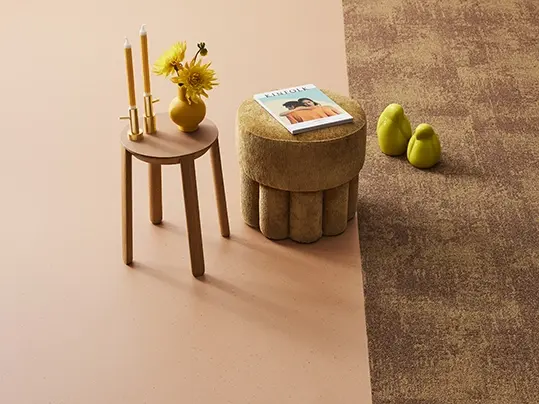
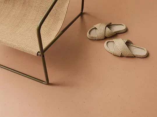
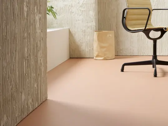
“Our Mood of the Season for the Autumn of 2023 reflects this warm and welcoming atmosphere with tactile materials and designs that embrace a casual and comfortable aesthetic. Blended warm neutrals combine with earthy hues and shades of peach, rust caramel, and terracotta," Dorothé continues.
"The salted caramel hue of our Marmoleum Cocoa range melts seamlessly with these warmer tones. The inclusion of cocoa husks gives the surface a distinctive texture that adds warmth and tactility. This sense of comfort and wellbeing is also echoed by our Tessera Infused 4507 | pickled spice, a soft organic pattern in a rich blend of peach, orange, and terracotta colours.”
