Pantone 2021
Carola Seybold, Director of Business Development at Pantone
March 2021
.png)
Colour delivers emotion, creates association, supports global brand recognition and wellbeing. It defines our world. Via a special zoom session earlier this year, our team joined Carola Seybold, Director of Business Development at Pantone, to learn more about the colour trends that we can expect to see more of in 2021 – and we are excited to be able to share these with you in this blog.
As a result of the current global health crisis, it is no surprise that one of the major trends for 2021 and beyond will be the need to adapt to new rules. Innovation and transformation are two very important key words when it comes to colour and all else in society.
With this transformation, new social movements have greatly accelerated which is impacting the way we live and giving rise to new colour designs and trends. People are spending more time at home and therefore, will invest more money into their interiors – and this might affect how often they change their colour schemes too.
.png)
.png)
As we continue to stay home, this brings us to the ‘meaning of home’. While people associate home with their families, home is also a space for indoor exercise, self-care and spirituality. And whilst we can’t travel, people are going out to explore nature in the nearby forests, all of which have an impact on colour trends. We can expect people to bring more of those greens inside, whether that is hanging plants on the walls, using botanical décor or doing it through the walls and floors.
The trend of spirituality will continue to dominate over the next year, as we look to make the effort to live a more balanced life. Yoga is not new, but uptake has certainly increased over the last year as people use the sport as an escapism or to improve focus and power. These trends have an impact on colour and dusty pinks, purples and blue tones are all associated with connection, which we can expect to see more of.
In 2021, we can expect to see more of a Folkloric colour palette; this is a mythic take on nature and might coexist in a rainbow of hues grounded in ancient motifs. This is a fresh take on all-but-forgotten traditions and various colourways and designs from the Flotex Planks collection can help to achieve this trend.
Traced back to its Italian roots, Terracotta means ‘baked earth’ and is an enduring and well-grounded hue that has been essential to the colour vocabulary since the beginning. Terracotta is fresh and the pastel hues are fascinating when combined with earthy shades. Similarly, the Composed colour theme guides us to more organic materials and calming natural hues.
.png)

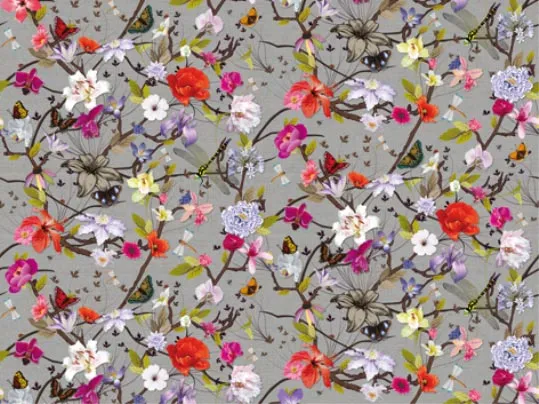
To brighten our interiors, the expressive Vivify colour palette infuses positivity and shapes new experiences. Flowers have long been nature’s most sublime colour expression, and this palette called Fleur, celebrates the intrinsic romance found in floral red tints and tones and is perfect for the office atmosphere.
Taking multi-cultural influences from the world of fashion and art, Quixotic deploys both closely matched colours and complementary pairings in intriguing combinations. And Polychrome looks into the spiritual colour combination, taking inspiration from traditional architecture. It is a story of complexity in colour, patterning and detail.
In line with this idea of being calm, the greens and blues of the Synergy palette is a mix of compatible colours with understated undertones. And finally, we will see more shades inspired by Galaxies, where the metallic tones influenced by intergalactic travels and new technologies will come to the forefront through the use of water blues, royal blues and purples.
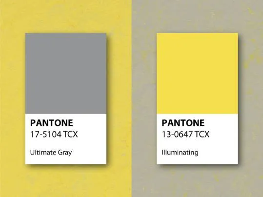
For only the second time in Pantone’s history, there are two colours chosen for Colour of the Year 2021. The contrasting difference between Ultimate Gray and Illuminating highlights the importance of two different themes coming together to support each other.
In 2021, Ulitmate Gray underlines the support of strength and Illuminate highlights positivity. At one end of the spectrum, the grey represents deeper feelings of thoughtfulness, steadfast and seriousness paying homage to wisdom, experience and intelligence.
And on the other side of the story, Illuminating reminds us that there is hope. A bright, joyful and optimistic yellow expressing the message of warmth a sunny day and that there is a light at the end of the tunnel.
